Components
Avatar

```css
.avatar {
  width: 40px;
  border-radius: 50%;
}

.avatar-large {
  width: 56px;
  border-radius: 50%;
}

.avatar-bordered {
  width: 40px;
  border-radius: 50%;
  box-shadow: 0 1px 2px rgba(0,0,0,0.2);
  border: white 1px solid;
}

.avatar-square {
  width: 40px;
  border-radius: 0px;
  box-shadow: 0 1px 2px rgba(0,0,0,0.2);
  border: white 1px solid;
}
```
```html
<img class="avatar" alt="avatar" src="https://scontent.fcdg2-1.fna.fbcdn.net/v/t31.18172-8/464710_10151468301110945_346348306_o.jpg?_nc_cat=106&ccb=1-7&_nc_sid=09cbfe&_nc_ohc=F1Ayjb6EVFwAX_iYQ0N&_nc_ht=scontent.fcdg2-1.fna&oh=00_AfC_1bRREmjn_x501Xy2Kna9fIDPcnL0sGQhsU8R8e_BcQ&oe=65145FF7" />
<img class="avatar-large" alt="avatar-large" src="https://scontent.fcdg2-1.fna.fbcdn.net/v/t31.18172-8/464710_10151468301110945_346348306_o.jpg?_nc_cat=106&ccb=1-7&_nc_sid=09cbfe&_nc_ohc=F1Ayjb6EVFwAX_iYQ0N&_nc_ht=scontent.fcdg2-1.fna&oh=00_AfC_1bRREmjn_x501Xy2Kna9fIDPcnL0sGQhsU8R8e_BcQ&oe=65145FF7" />
<img class="avatar-bordered" alt="avatar-bordered" src="https://scontent.fcdg2-1.fna.fbcdn.net/v/t31.18172-8/464710_10151468301110945_346348306_o.jpg?_nc_cat=106&ccb=1-7&_nc_sid=09cbfe&_nc_ohc=F1Ayjb6EVFwAX_iYQ0N&_nc_ht=scontent.fcdg2-1.fna&oh=00_AfC_1bRREmjn_x501Xy2Kna9fIDPcnL0sGQhsU8R8e_BcQ&oe=65145FF7" />
<img class="avatar-square" alt="avatar-square" src="https://scontent.fcdg2-1.fna.fbcdn.net/v/t31.18172-8/464710_10151468301110945_346348306_o.jpg?_nc_cat=106&ccb=1-7&_nc_sid=09cbfe&_nc_ohc=F1Ayjb6EVFwAX_iYQ0N&_nc_ht=scontent.fcdg2-1.fna&oh=00_AfC_1bRREmjn_x501Xy2Kna9fIDPcnL0sGQhsU8R8e_BcQ&oe=65145FF7" />
```
Button
Write a story Book now Start now
```html
<a class="btn btn-ghost" href="#">Write a story</a>
<a class="btn btn-flat" href="#">Book now</a>
<a class="btn btn-gradient" href="#">Start now</a>
```
```css
.btn-ghost {
  color: #4A4A4A;
  border: 1px solid #4A4A4A;
  padding: 8px 24px;
  border-radius: 50px;
  font-weight: lighter;
  opacity: 0.6;
  transition: opacity 0.3s ease;
}

.btn-ghost:hover {
  opacity: 1;
}

.btn-flat {
  color: white;
  padding: 8px 24px;
  border-radius: 4px;
  background: #670BFF;
  transition: background 0.3s ease;
}

.btn-flat:hover {
  background: #4D04C4;
  color: white;
}

.btn-gradient {
  color: white;
  padding: 8px 24px;
  border-radius: 4px;
  font-weight: bold;
  background: linear-gradient(#167FFB, #0F60C4);
  transition: background 0.3s ease;
  border: 1px solid #0F60C4;
}

.btn-gradient:hover {
  background: linear-gradient(#147EFF, #0F67DA);
  color: white;
}
```
Card category
Breakfast
```html
<div class="card-category" style="background-image: linear-gradient(rgba(0,0,0,0.3), rgba(0,0,0,0.3)), url(https://raw.githubusercontent.com/lewagon/fullstack-images/master/uikit/breakfast.jpg)">
  Breakfast
```
```css
.card-category {
  background-size: cover;
  background-position: center;
  height: 180px;
  display: flex;
  justify-content: center;
  align-items: center;
  color: white;
  font-size: 24px;
  font-weight: bold;
  text-shadow: 1px 1px 3px rgba(0,0,0,0.2);
  border-radius: 5px;
  box-shadow: 0 0 15px rgba(0,0,0,0.2);
}
```
Card product
Product name
Product description with relevant info only.
```html
<div class="card-product">
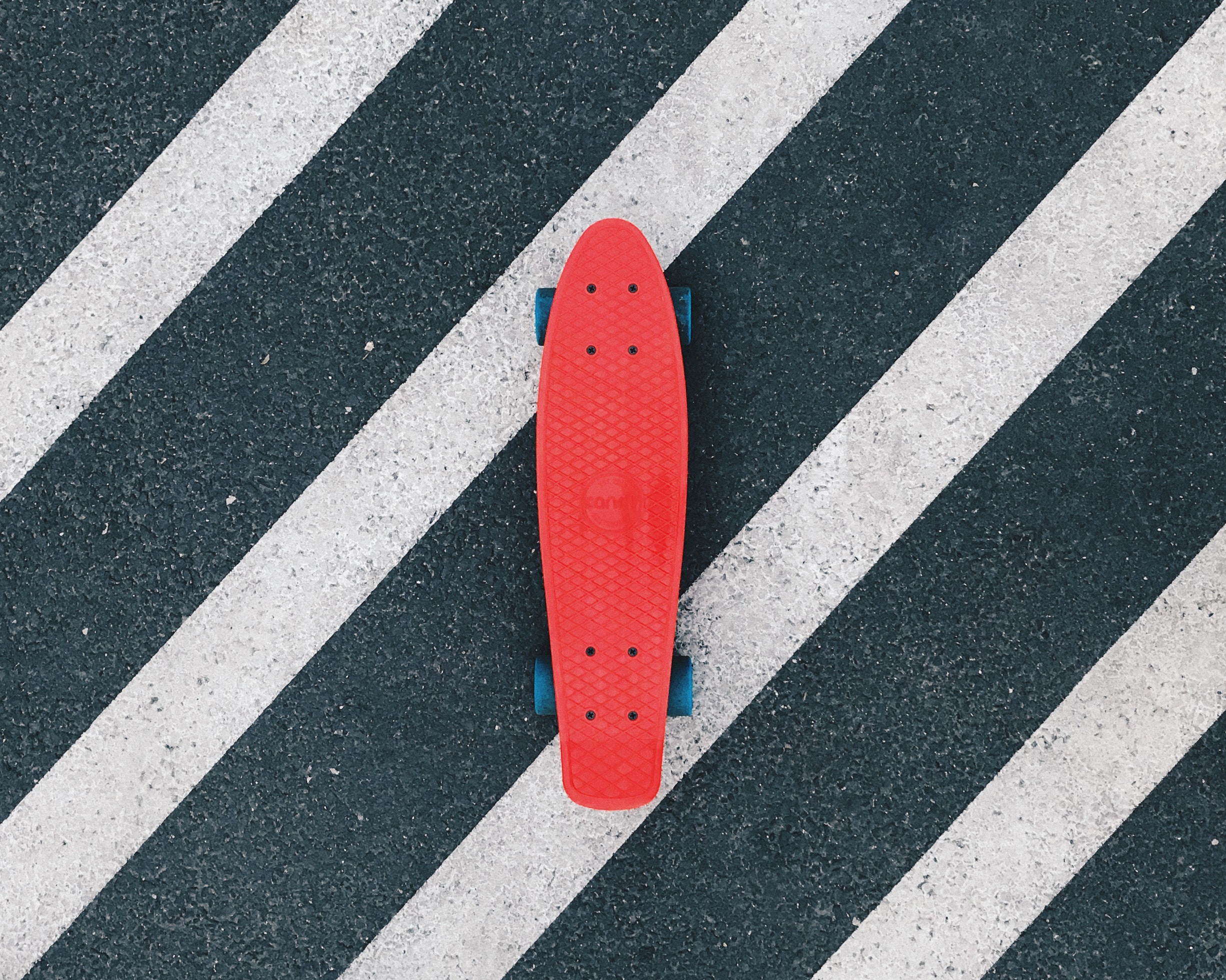
<img src="https://raw.githubusercontent.com/lewagon/fullstack-images/master/uikit/skateboard.jpg" />
<div class="card-product-infos">
<p>Product name</p>
<p>Product description with <strong>relevant info</strong> only.</p>
</div>
</div>
```
```css
.card-product {
  overflow: hidden;
  height: 120px;
  background: white;
  box-shadow: 0 0 15px rgba(0,0,0,0.2);
  display: flex;
  align-items: center;
}

.card-product img {
  height: 100%;
  width: 120px;
  object-fit: cover;
}

.card-product h2 {
  font-size: 16px;
  font-weight: bold;
  margin: 0;
}

.card-product p {
  font-size: 12px;
  line-height: 1.4;
  opacity: .7;
  margin-bottom: 0;
  margin-top: 8px;
}

.card-product .card-product-infos {
  padding: 16px;
}
```
Search bar
```html
<form novalidate="novalidate" class="simple_form search" action="/" accept-charset="UTF-8" method="get">
  <div class="search-form-control form-group">
    <input class="form-control string required" type="text" name="search[query]" id="search_query" />
    <button name="button" type="submit" class="btn btn-flat">
      <i class="fas fa-search"></i> Search
    </button>
  </div>
</form>
```
```css
.search-form-control {
  position: relative;
}

.search-form-control .btn {
  position: absolute;
  top: 8px;
  bottom: 8px;
  right: 8px;
}

.search-form-control .form-control {
  height: 3.5rem;
  box-shadow: 0 2px 6px rgba(0,0,0,0.08);
  border: 1px solid #E7E7E7;
}

.search-form-control .form-control:focus {
  border: 1px solid #1EDD88;
  outline: none !important;
  box-shadow: 0 2px 6px rgba(0,0,0,0.08);
}
```
Banner
```html
<div class="banner" style="background-image: linear-gradient(rgba(0,0,0,0.4),rgba(0,0,0,0.4)), url(https://raw.githubusercontent.com/lewagon/fullstack-images/master/uikit/background.png);">
  <div class="container">
    <p>Le Wagon brings <strong>tech skills</strong> to <strong>creative people</strong>!</p>
    <p>Change your life and learn to code at one of our campuses around the world.</p>
    <a class="btn btn-flat" href="#">Apply now</a>
  </div>
</div>
```
```css
.banner {
  background-size: cover;
  background-position: center;
  padding: 150px 0;
}

.banner h1 {
  margin: 0;
  color: white;
  text-shadow: 1px 1px 3px rgba(0,0,0,0.2);
  font-size: 32px;
  font-weight: bold;
}

.banner p {
  font-size: 20px;
  color: white;
  opacity: .7;
  text-shadow: 1px 1px 3px rgba(0,0,0,0.2);
}
```
Card with an avatar
Title here
Short description here!
99.99
```html
<div class="card-trip">
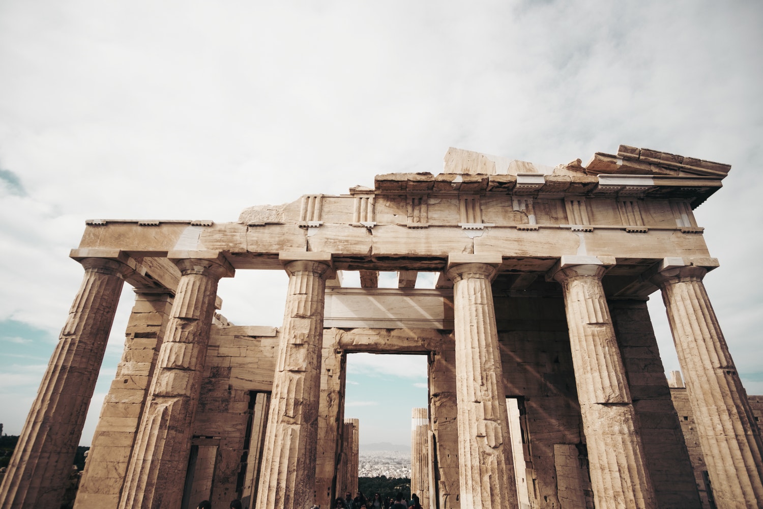
<img src="https://raw.githubusercontent.com/lewagon/fullstack-images/master/uikit/greece.jpg" />
<div class="card-trip-infos">
<div>
<p>Title here</p>
<p>Short description here!</p>
</div>
<p class="card-trip-pricing">99.99</p>
<img src="https://scontent.fcdg2-1.fna.fbcdn.net/v/t31.18172-8/464710_10151468301110945_346348306_o.jpg?_nc_cat=106&ccb=1-7&_nc_sid=09cbfe&_nc_ohc=F1Ayjb6EVFwAX_iYQ0N&_nc_ht=scontent.fcdg2-1.fna&oh=00_AfC_1bRREmjn_x501Xy2Kna9fIDPcnL0sGQhsU8R8e_BcQ&oe=65145FF7" class="card-trip-user avatar-bordered" />
</div>
</div>
```
```css
.card-trip {
  overflow: hidden;
  background: white;
  box-shadow: 0 0 15px rgba(0,0,0,0.2);
}

.card-trip > img {
  height: 200px;
  width: 100%;
  object-fit: cover;
}

.card-trip h2 {
  font-size: 16px;
  font-weight: bold;
  margin: 0;
}

.card-trip p {
  font-size: 12px;
  opacity: .7;
  margin: 0;
}

.card-trip .card-trip-infos {
  padding: 16px;
  display: flex;
  justify-content: space-between;
  align-items: flex-end;
  position: relative;
}

.card-trip-infos .card-trip-user {
  position: absolute;
  right: 16px;
  top: -20px;
  width: 40px;
}
```
Footer
```html
<div class="footer">
  <div class="footer-links">
    <a href="#"><i class="fab fa-github"></i></a>
    <a href="#"><i class="fab fa-instagram"></i></a>
    <a href="#"><i class="fab fa-facebook"></i></a>
    <a href="#"><i class="fab fa-twitter"></i></a>
    <a href="#"><i class="fab fa-linkedin"></i></a>
  </div>
  <div class="footer-copyright">
    This footer is made with <i class="fas fa-heart"></i> at Le Wagon
  </div>
</div>
```
```css
.footer {
  background: #F4F4F4;
  display: flex;
  align-items: center;
  justify-content: space-between;
  height: 100px;
  padding: 0px 50px;
  color: rgba(0,0,0,0.3);
}
.footer-links {
  display: flex;
  align-items: center;
}
.footer-links a {
  color: black;
  opacity: 0.15;
  text-decoration: none;
  font-size: 24px;
  padding: 0px 10px;
}
.footer-links a:hover {
  opacity: 1;
}
.footer .fa-heart {
  color: #D23333;
}
```
Card grids
Breakfast
Lunch
Dinner
```html
<div class="cards">
  <div class="card-category" style="background-image: linear-gradient(rgba(0,0,0,0.3), rgba(0,0,0,0.3)), url(https://raw.githubusercontent.com/lewagon/fullstack-images/master/uikit/breakfast.jpg)">
    Breakfast
  </div>

  <div class="card-category" style="background-image: linear-gradient(rgba(0,0,0,0.3), rgba(0,0,0,0.3)), url(https://raw.githubusercontent.com/lewagon/fullstack-images/master/uikit/lunch.jpg)">
    Lunch
  </div>

  <div class="card-category" style="background-image: linear-gradient(rgba(0,0,0,0.3), rgba(0,0,0,0.3)), url(https://raw.githubusercontent.com/lewagon/fullstack-images/master/uikit/dinner.jpg)">
    Dinner
  </div>
</div>
```
```css
.cards {
  display: grid;
  grid-template-columns: 1fr 1fr 1fr;
  grid-gap: 16px;
}

// Smallest device
@media (min-width: 100px) and (max-width: 575px) {
  .cards {
    grid-template-columns: 1fr;
  }
}

// Small devices (landscape phones, 576px and up)
@media (min-width: 576px) {
  .cards {
    grid-template-columns: 1fr;
  }
}

// Medium devices (tablets, 768px and up)
@media (min-width: 768px) {
  .cards {
    grid-template-columns: 1fr 1fr;
  }
}

// Large devices (desktops, 992px and up)
@media (min-width: 992px) {
  .cards {
    grid-template-columns: 1fr 1fr 1fr;
  }
}

// Extra large devices (large desktops, 1200px and up)
@media (min-width: 1200px) {
  .cards {
    grid-template-columns: 1fr 1fr 1fr;
  }
}
```
Background note
note
```html
<div class="background-note">note</div>
```
```css
.background-note {
  width: content;
  background: #009578;
  padding: 5px;
  border-radius: 5px;
}
```
note
  ```html
  <div class="background-note-max">note</div>
  ```
  ```css
.background-note-max {
  width: max-content;
  background: #009578;
  padding: 5px;
  border-radius: 5px;
}
```
Box vertical text
Text
Le Lorem Ipsum est simplement du faux texte employé dans la composition et la mise en page avant impression. Le Lorem Ipsum est le faux texte standard de l'imprimerie depuis les années 1500```html
<div class="box"><p>Text</p>Le Lorem Ipsum est simplement du faux texte employé dans la composition et la mise en page avant impression. Le Lorem Ipsum est le faux texte standard de l'imprimerie depuis les années 1500</div>
```
```css
.box {
  box-shadow: 0 0 15px rgba(0,0,0,0.2);
  padding: 2rem;
  border-radius: 2rem;
  background: grey;
  display: flex;
  color: black;
}

.box p {
  writing-mode: vertical-rl;
  color: black;
}
```
Enjoy Reading This Article?
Here are some more articles you might like to read next: